I have created a new blog for my A2 coursework. Here is a link to it:
http://sophieolivera2.blogspot.com/
Wednesday, 15 June 2011
Monday, 9 May 2011
Evaluation-Looking back at my preliminary task, what have I learnt in the progression it to the full product?
 This was the final product of my preliminary task. I used Microsoft Publisher to create this. Looking at this now, the first thing that catches my eye is that it quite basic in the design and layout. It lacks colour and doesn't seem as appealing as I first thought. It still looks good, just a bit simple really. The image is dominating the page and makes it the main focus of attention here as well.
 Now compared to my prelim task, my OFC looks more structured and professional. I used better programmes such as Picasa, Picnik and Photoshop to create it. It looks more appealing due to the contrasts in colours (the yellow with silvery-grey background). There is a good balance between the text and the images here too.
To summarise then, I feel that I have learnt how to use the technologies around me to good effect. Beforehand, I would occassionally use programmes such as Picasa and Photoshop, but now I find them easy to use and I want to use them.
I have also learnt how hard it is to keep to deadlines in the magazine industry. I never realised the full scale of the construction that goes into making a good magazine. Of course, magazine industries would usually only have a few days whereas we've had a few weeks. Then again, there would be a person working on each bit seperately on a real magazine, not just one person doing the whole magazine.
I also found it interesting to learn about the theories of media and in particular the memes and tropes in our society. To me, they had always been there but I would have never really thought about them-I just accpeted them. Now though I start to think about them in everyday situations.
Finally, the final thing that I have learnt is to alway proof read your work before saving it!
Evaluation-What kind of media institution might distribute my media product?
There are two main media institutions that distribute music magazines in the UK. The first one is the Bauer Media Group Inc. They distribute the magazines of Q, Mojo and Kerrang! The other one is IPC Media, which are responsible for distributing the NME.
Although the Bauer Media Group Inc. are probably the most popular choice, I think that IPC Media would be better at distributing my media product. This is mainly because the magazines at the Bauer Media Group Inc. distribute more glossy magazines. I feel that my magazine has more of a rougher edge to it, which is similar to NME. Also, the other magazines that they distribute (such as Look magazine) are aimed at a younger audience, which is my target audience. They also tend to deal
with weekly magazines, which again is what I would aim to do.


Then again, this conclusion was drawn from looking at my OFC and contents page. When I look at my DPS, it looks less rough. I still think though that taking other factors into account, IPC Media would probably be the best institution for my magazine.
My magazine would be distributed into shops and supermarkets as the front cover has been designed to stand out in amongst the other magazines on the shop's shelf. Would I have my magazine online or as a kindle? Possibly. There certainly seems to be a growing trend of books/magazines in this format. Although I personally like to have a paper magazine, I am trying to appeal to a wider audience so this may mean keeping up to date with modern technology trends.
Evaluation-How did attract/address your audience?
In answer to the question of how did I attract my audience, I bribbed them with money sweets!
I joke of course. What I have done though is asked people who I feel would be my general audience to give their opinions of my magazine to see whether they would attracted to it.
1. What do you like about my magazine?
Josh: There's nothing wrong with it.
Kirsten: Good use of imaging and interesting layout.
Matt: The colour contrast on the front cover.
Jemma: The photography, dark colours with the yellow on the front cover-it stands out.
Sarah: Love the background image on your DPS. Also loving the yellow font.
2. What appeals to you the most?
Josh: The guitar on the front!
Kirsten: Eye-cathcing front image and font.
Matt: Just the general layout-it's different but cool.
Jemma: Yellow font on cover, photos in the tunnel.
Sarah: The boldness of the text.
3. Is there anything that you don't like about my magazine/would want improving on?
Josh: Not really.
Kirsten: No, all works well.
Matt: I think the title (brand name) should be bigger, but that's my only complaint.
Jemma: No, looks very professional.
Sarah: Nope.
4. If this magazine was real, would you buy it?
Josh: Probably not but I don't really buy magazines.
Kirsten: Maybe, I don't read many magazines.
Matt: Yes.
Jemma: Yes, looks like it would appeal to people who like rock music, and I like music magazines.
Sarah: Yes! It looks like a good quality magazine that'd be good to read.
Evaluation-How does your media product represent particular social groups?
Above is a short humourous clip that I thought of on the spot really to outline who my target social group are. As I have mentioned on previous posts, my target audience belong to indie/rock social group. They are passionate about music and tend to stay clear from the mainstream pop market, e.g. Justin Bieber.
The main way I suppose I have represented my social group is through the brand name, 'Revolutions'. Linking to the speed of a vinyl record, RPM, it signifies that the readers of this magazine will be really interested in their music. The slogan tagline above indicates that the magazine will include classic rock bands as well as more modern music.
Of course as the social group I'm aiming my magazine at is aged 15-25, I've also made more references to modern bands as well more older ones throughout the magazine. I have also mentioned things that would appeal to a younger audience, e.g. the tagline "The UK's biggest gigs this summer" on the OFC.
Please remember no books or Bieber's were harmed in the making of this film! I'm sorry if you are a fan of Justin Bieber though. It was just to get my point accross that the social group aren't fond of mainstream pop such as his music and would prefer to read my magazine.
Evaluation-Who would be the audience for my media product?

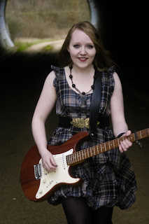
This is Sarah. Sarah would be a typical reader of Revolutions magazine. She's has her own unique style but also likes to display her love music through the clothes she wears, e.g. the Avenged Sevenfold hoody. She is also stereotypical of a rocker-she wear bold make up, purple hair, nose piercing, etc. Sarah obviously follows the conventions of other indie/rock people.
Of course, with the penumbra effect, you never know who will read my magazine. For all I know it could be this man...
...then again maybe not!
Sunday, 8 May 2011
Evaluation-What have you learnt about technologies from this process of constructing this product?
Above is a short presentation about what I have used during this process.
As far as what I've learnt, the answer is quite a bit. Before this experience, I did know quite a bit about the technologies but now I feel that I have developed my knowledge further.
Adobe Photoshop Cs, for example, was something that my Dad had used for years but I'd never looked at before because I was happy with Picnik and Picasa. I had to use it though to follow the conventions of the artists head being infront of the magazine. After a few trials though, I found the program surprisingly easy to use.
Blogger is another technology I have learnt to use. Again, I found this quite easy to use even though it was a bit confusing to begin with.
The only trouble I had was with fontspace.com. First it wouldn't let me download the fonts. Then when I finally got them onto my computer, they didn't work. Fortunately, I eventually found another solution. So I guess one thing I've learnt is that you should always have a plan B if things don't turn out how you wanted them.
Overall then, the technologies have been easy to use and have not been in the way of producing my magazine.
Thursday, 5 May 2011

Wednesday, 4 May 2011
Evaluation-In what ways does your media product use, develop or challenge forms and conventions of real media products?
 The front cover is quite typical to the other music magazines on the market. Influenced from an issue of NME, the colour scheme is basic yet still has one/two bold colours to attract the audience. The artists head overlaps over the brand name as that draws attention to the artist and alos the brand name is already recognisable. The artist is not looking at the camera though, which is slightly unconventional as pretty much all the artists do with magazine front covers.
 My contents page in the end has sticked to the conventional layout of a music magazine and I'd say I have followed the conventions of NME again here. The colour scheme is quite minimal with one major bold colour that makes the fonts stand out more. What I decided to do though was instead of having an "Editor's notes" section, I decided to have a "Editor's quotes" section. This is a bit more quirky and may want readers to read them. Personally, I don't look at the "Editor's notes" because some can just drag on, so a quote is easier and quicker to read but still gets a message across.
Finally, my DPS is quite unconventional compared to others on the market. However, it was influenced from an article in Q magazine. The body is laid out around the main image instead of being on top of it. This draws attention to Becky who is the "centre of attention" in the middle of the tunnel. I also added a mid shot photo of Becky with a vignette frame so readers actually know who she is. Again, the colour scheme has been kept very basic-white font on top of a black background. If I had enough room, I would have included a pull quote. However, when placed on the DPS, the balance of text and images became unbalanced.
Overall though, whether they're conventional or not, I'm proud of all three pieces of work.
Wednesday, 13 April 2011
First draft of contents page

It's slightly unconventional compared to other magazines on the market today. However, I wanted it to be a little bit different and quirky because I personally like stuff such as that. Unfortunately, this does mean that I don't have a style model for this page.
I like the photos being put in a polaroid frame and then have text that looks slightly hand written on them. It gives it a more authentic look and this idea of being old/vintage, which is linked back into the brand name 'Revolutions'.
So as I usually say on here, any feedback would be lovely :)
Final DPS


So, I finally have my double page spread for my music magazine, which I'm overall pleased with. Below it is my style model from an issue of Q I found. I liked the layout of the spread so I thought I'd do something similar with mine. Sorry it's not the best quality of photos. I don't own a scanner and the only camera working at the time was the one on my iPod!
Again, any feedback would be lovley.
I've made some mistakes on my DPS!
Yeah, I'm an idiot!
Basically, after proof reading my work, I realised that I made some mistakes on my DPS that were minor but still noticeable. However, last night I accidentally saved my work so I cannot change anything to the body appart from add more text. So now, I have to start from scratch and remake the whole DPS again!
I'm just blogging this to notify you so if my DPS looks different you know why (not just because I'm really annoyed at myself!).
Tuesday, 12 April 2011
My DPSs-opinions?
Here's what I've done for my DPS. At the moment, I'm undecided on which I prefer. The first one looks okay to me but I fear it may look a bit boring for the audience. The second one has another picture on it and we can see who Becky is more clearly. However, I feel that it looks a bit over-the-top and over crowded on that one. I was also thinking for the first one, I may add in a pull quote. So any feedback or suggestions on how to make it look better would be helpful. Even if it's to say change the font colour! :)


Oh yes, and I'll also be posting my style model shortly once I've taken a photo of it :)


Oh yes, and I'll also be posting my style model shortly once I've taken a photo of it :)
Monday, 11 April 2011
Final front cover

So this the final product. Overall, I'm pleased with the way it has turned out. I ended up using one of the photos of Becky and another photo of myself for the free poster icons just to give it a bit of diversity. I'll probably do the same for contents page. I've also added a barcode using www.barcoding.com/upc/, which is a free barcode generator. Then I added the issue number, date and price above it.
My magazine cover's style model is a front cover from NME, which is pictured below:

My OFC so far
So originally, I made my brand name look like this:

But when I tried editing on the taglines, I wanted them in different colour to the brand name. This became a problem as it looked like the brand name was standing out too. The taglines just seemed to blend with the picture and weren't standing out.

I then looked on the NME website for inspiration and came across the front cover below. Both the brand name and main taglines are in the same colour. There are also in yellow which isn't very conventional but still stands out. The taglines in white are also outlined a little bit so they stand out too. Therefore I decided to base my OFC on this issue of NME and change the style of the brand name.

Here is my OFC so far. I decided to use yellow in the end because it contrasts with the rest of the picture. I am pleased with what I've done so far and will probably add more to it later (e.g. bar code, more taglines, more posters, etc.)

Any feedback on what I've done so far would be much appreciated :)
More problems-but I am solving them!

Okay, so after getting the fonts that I wanted onto my computer, they don't actually work. When I try to type something in, only a few of the letters actually show up, as shown above.
This has meant that I had to find another way of making my OFC look appealing and stand out. Currently, I am half way through making the OFC for magazine now and will blog what I have done soon.
Wednesday, 6 April 2011
Problems I've encountered
At the moment I've been trying to download some fonts from the internet onto my computer. This is so I can make my magazine look a bit more professional. Also, the fonts that I have tried on Picasa don't to stand out on the picture, so I wanted a font that maybe had an outline to stand out more.
Unfortunately, my computer isn't allowing me to use the fonts once I've downloaded them. So, with some help from Sarah Tye, I'll either try to eventually get the fonts onto Picasa or i'll just settle with the fonts I have on Picasa.
Monday, 28 March 2011
Putting the brand name onto the OFC
So after finally deciding which picture I would use, I decided to put the brand name onto it. As I have mentioned in my previous, the majority of music magazines have the artist on the OFC infront of the brand name. This was something I wanted to do on my OFC, therefore (with a bit of help from my Dad) I tried to create this using Adobe Photoshop CS. Here are the steps I took:
Firstly, I put the brand name onto a copy of the picture in Picasa and opened it in Photoshop.

I then opened the original copy of the picture onto Photoshop with the other copy.

Next, I clicked on the photo with the brand name on and dragged it on top of the other picture to create two seperate layers.

After that I clicked on the mask button and then the paint button. This "cuts a hole" on the top layer to reveal a part of the other layer underneath.

Here is what it looked like afterwards.

Once that was done, I clicked on an arrow on the box shown below and clicked on Flatten Image. This makes the two become one.

This is the final image:

I decided to name my magazine 'Revolutions' for two reasons. I first came up with the idea when trying to think of brand name that is related to music. The word revolutions comes from the phrase RPM (revolutions per minute) on a vinyl record. Another reason for having Revolutions as the brand name as it is associated with the revolutions in inide/rock music. Subsequently, the music magazine will appeal to more older audience than what I initially intended. It will also appeal to real music lovers though; it will appeal to people who are passionate about music.
I will work on the rest of this OFC later because I'm not sure whether to stick to the font or not. However, I decide shortly and re-doing this won't be hard now that I know what to do. Nethertheless, any feedback would helpful.
Thursday, 24 March 2011
Analysing music magazines logos
While I was trying to make my logo for the magazine, I had trouble deciding on the font and colours I should use. Therefore, I decided to analyse already existing magazine logos to give me some inspiration.


There are similarities between this logos. The first one being that the colour palette is basic and all of the magazines use the same colours of red, black and white. Another similarity is that the fonts used are bold and are sans serif.

The ones that stand most the Kerrang! and Mojo logos. The Kerrang! logo has designed to give it a broken glass look. This portrays a violent attitude that is associated with this magazine and the stereotypical people who read it. The Mojo logo is black and bold but also has red writing over the top of it. The red font looks like it was hand written. This logo stuck out to me as it was different to the others and I thought I could try something like this with my logo.
Wednesday, 23 March 2011
Evolution of genres
This theory originally applies to film studies but can be adapted to other mediums.
Prototype(s)-the original seminal texts of a genre. Conventions aren't "set" so there may be more variety. This would be the early stages of producing a music magazine. So, for example, the early stages of producing NME magazine would have in the 50s/60s been a prototype.
Classic- the conventions are established. Texts are "perfect" examples of the genre. They don't have to be good, just conventional.
Revisionist-the conventions are rewritten, because society changes or the classic conventions become stale.
Parodic-this mocks the conventions of genres. This phase doesn't happen in magazines.
Post modern-one aspect of post modernism is bricolage. This is the recombining of old elements and elements from other cultures to centre something new. An obsession with "retro". However, some people claim "it's all been done already."
Monday, 21 March 2011
Having a go at editing
So at the moment, I've just been experimenting with the editing techniques with my photos on Picasa and Picnik. This is just to get an overall idea of what I would like my magazine to look like.

For this image, I did the same as the one above. I used this effect as I thought it made the images look more dramatic. I also liked the vignette around the edge.

This image has a polaroid frame. I like the framing and I'll probably use it for the images in my contents page. This will show an aspect of bricolage in my magazine. It will give it a retro effect, which has become a popular thing to do today in society.

Finally, on this image, I have put some text onto the clapper board. This is only a trial to see what it looks like and whether I can incorporate it into the actual magazine. The sans serif font is called Papyrus and makes it look like it was actually written onto the board.

Wednesday, 16 March 2011
Memes and tropes
A couple of lessons ago we had a lesson about what memes and tropes were. Here is what I found out. A meme is an element or idea that is transmitted or evolves in a culture. Often this meme appears independently in different works of art, e.g. time travel motifs, sci-fi, music, etc. When producing my music magazine, I need to make sure that the memes of indie/rock A trope is a recurring element in art of culture. For example, fantasy films are always set in medieval times. Sometimes tropes are rewritten, which is called revisionism. Generally, tropes stay the same because audiences prefer them. Another example is that the tropes related to rock music are:
- loud music
- electric guitars
- anger
- violence
- rebellious music
- often more poltical
My picture compared to a shot from Brick
People who like indie/rock music tend to like independent films. The film Brick is a independent film and there is a shot where the characters are in a tunnel. My black and photo of Becky exemplifies this shot from Brick. This will then attract to my audience.
My picture:


The shot from Brick:
Friday, 11 March 2011
Photo shoot completed!
Today, my model and I went and did our photo shoot for my music magazine. There were some slight difficulties when taking the photos (such as the focus of the photograph of the wind), but overall, the photos came out pretty good. We took a few props with us such as a guitar, a clapperboard and a mask to get variation of interest in the photos.
So here are just a few of the photos from today that I'm considering putting in my final coursework:


 There are other photos that I took which I may consider putting in the magazine as well. They can be found on this web address:
https://picasaweb.google.com/115551485608518332962/BeckyPhotoshootForMediaCoursework?authkey=Gv1sRgCPGOq9z92__bmAE
Of course I'll have to edit some of these photos as well. Here's one I tried earlier just as an experiment to see how hard it was to edit pictures. I also had some help from my dad who showed me how to get this effect:

So here are just a few of the photos from today that I'm considering putting in my final coursework:


https://picasaweb.google.com/115551485608518332962/BeckyPhotoshootForMediaCoursework?authkey=Gv1sRgCPGOq9z92__bmAE
Of course I'll have to edit some of these photos as well. Here's one I tried earlier just as an experiment to see how hard it was to edit pictures. I also had some help from my dad who showed me how to get this effect:

Subscribe to:
Posts (Atom)