While I was trying to make my logo for the magazine, I had trouble deciding on the font and colours I should use. Therefore, I decided to analyse already existing magazine logos to give me some inspiration.


There are similarities between this logos. The first one being that the colour palette is basic and all of the magazines use the same colours of red, black and white. Another similarity is that the fonts used are bold and are sans serif.

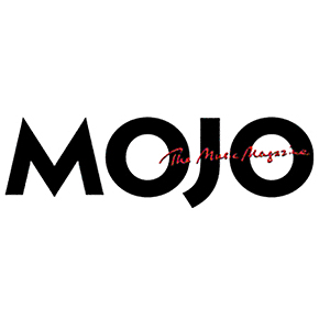
The ones that stand most the Kerrang! and Mojo logos. The Kerrang! logo has designed to give it a broken glass look. This portrays a violent attitude that is associated with this magazine and the stereotypical people who read it. The Mojo logo is black and bold but also has red writing over the top of it. The red font looks like it was hand written. This logo stuck out to me as it was different to the others and I thought I could try something like this with my logo.
No comments:
Post a Comment