Monday 28 March 2011

Putting the brand name onto the OFC

So after finally deciding which picture I would use, I decided to put the brand name onto it. As I have mentioned in my previous, the majority of music magazines have the artist on the OFC infront of the brand name. This was something I wanted to do on my OFC, therefore (with a bit of help from my Dad) I tried to create this using Adobe Photoshop CS. Here are the steps I took:


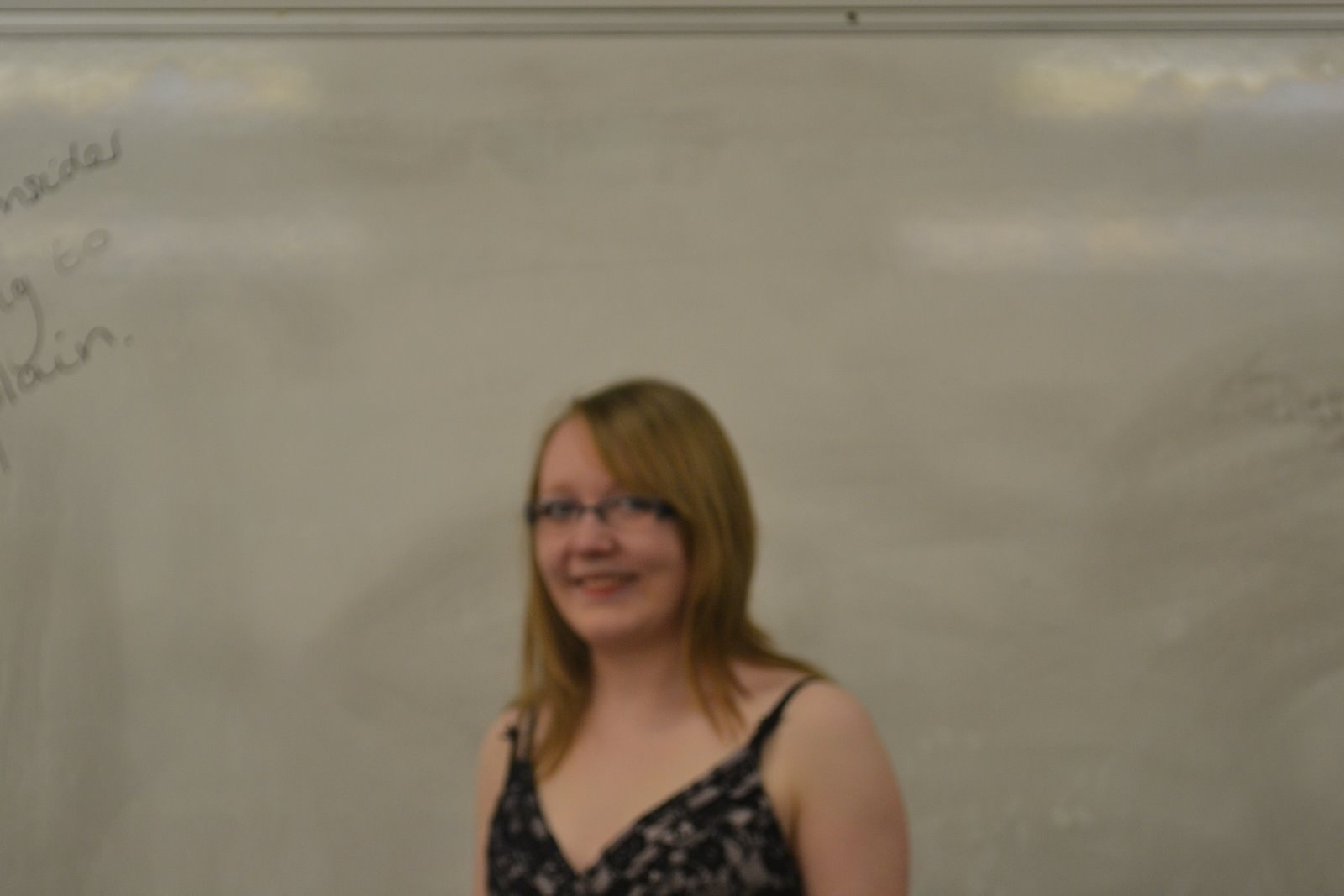
Firstly, I put the brand name onto a copy of the picture in Picasa and opened it in Photoshop.


I then opened the original copy of the picture onto Photoshop with the other copy.


Next, I clicked on the photo with the brand name on and dragged it on top of the other picture to create two seperate layers.


After that I clicked on the mask button and then the paint button. This "cuts a hole" on the top layer to reveal a part of the other layer underneath.


Here is what it looked like afterwards.


Once that was done, I clicked on an arrow on the box shown below and clicked on Flatten Image. This makes the two become one.


This is the final image:


I decided to name my magazine 'Revolutions' for two reasons. I first came up with the idea when trying to think of brand name that is related to music. The word revolutions comes from the phrase RPM (revolutions per minute) on a vinyl record. Another reason for having Revolutions as the brand name as it is associated with the revolutions in inide/rock music. Subsequently, the music magazine will appeal to more older audience than what I initially intended. It will also appeal to real music lovers though; it will appeal to people who are passionate about music.


I will work on the rest of this OFC later because I'm not sure whether to stick to the font or not. However, I decide shortly and re-doing this won't be hard now that I know what to do. Nethertheless, any feedback would helpful.

Thursday 24 March 2011

Analysing music magazines logos

While I was trying to make my logo for the magazine, I had trouble deciding on the font and colours I should use. Therefore, I decided to analyse already existing magazine logos to give me some inspiration.


There are similarities between this logos. The first one being that the colour palette is basic and all of the magazines use the same colours of red, black and white. Another similarity is that the fonts used are bold and are sans serif.


The ones that stand most the Kerrang! and Mojo logos. The Kerrang! logo has designed to give it a broken glass look. This portrays a violent attitude that is associated with this magazine and the stereotypical people who read it. The Mojo logo is black and bold but also has red writing over the top of it. The red font looks like it was hand written. This logo stuck out to me as it was different to the others and I thought I could try something like this with my logo.


Wednesday 23 March 2011

Evolution of genres

This theory originally applies to film studies but can be adapted to other mediums.

Prototype(s)-the original seminal texts of a genre. Conventions aren't "set" so there may be more variety. This would be the early stages of producing a music magazine. So, for example, the early stages of producing NME magazine would have in the 50s/60s been a prototype.

Classic- the conventions are established. Texts are "perfect" examples of the genre. They don't have to be good, just conventional.

Revisionist-the conventions are rewritten, because society changes or the classic conventions become stale.

Parodic-this mocks the conventions of genres. This phase doesn't happen in magazines.

Post modern-one aspect of post modernism is bricolage. This is the recombining of old elements and elements from other cultures to centre something new. An obsession with "retro". However, some people claim "it's all been done already."

Monday 21 March 2011

Having a go at editing

So at the moment, I've just been experimenting with the editing techniques with my photos on Picasa and Picnik. This is just to get an overall idea of what I would like my magazine to look like.

For this image, I used Picnik. I set the picture onto holga-ish and then cinemascope.


For this image, I did the same as the one above. I used this effect as I thought it made the images look more dramatic. I also liked the vignette around the edge.


This image has a polaroid frame. I like the framing and I'll probably use it for the images in my contents page. This will show an aspect of bricolage in my magazine. It will give it a retro effect, which has become a popular thing to do today in society.


Finally, on this image, I have put some text onto the clapper board. This is only a trial to see what it looks like and whether I can incorporate it into the actual magazine. The sans serif font is called Papyrus and makes it look like it was actually written onto the board.

Wednesday 16 March 2011

Memes and tropes

A couple of lessons ago we had a lesson about what memes and tropes were. Here is what I found out. A meme is an element or idea that is transmitted or evolves in a culture. Often this meme appears independently in different works of art, e.g. time travel motifs, sci-fi, music, etc. When producing my music magazine, I need to make sure that the memes of indie/rock A trope is a recurring element in art of culture. For example, fantasy films are always set in medieval times. Sometimes tropes are rewritten, which is called revisionism. Generally, tropes stay the same because audiences prefer them. Another example is that the tropes related to rock music are:

  • loud music

  • electric guitars

  • anger

  • violence

  • rebellious music

  • often more poltical

My picture compared to a shot from Brick

People who like indie/rock music tend to like independent films. The film Brick is a independent film and there is a shot where the characters are in a tunnel. My black and photo of Becky exemplifies this shot from Brick. This will then attract to my audience.

My picture:


The shot from Brick:

Friday 11 March 2011

Photo shoot completed!

Today, my model and I went and did our photo shoot for my music magazine. There were some slight difficulties when taking the photos (such as the focus of the photograph of the wind), but overall, the photos came out pretty good. We took a few props with us such as a guitar, a clapperboard and a mask to get variation of interest in the photos.

So here are just a few of the photos from today that I'm considering putting in my final coursework:


There are other photos that I took which I may consider putting in the magazine as well. They can be found on this web address:
https://picasaweb.google.com/115551485608518332962/BeckyPhotoshootForMediaCoursework?authkey=Gv1sRgCPGOq9z92__bmAE

Of course I'll have to edit some of these photos as well. Here's one I tried earlier just as an experiment to see how hard it was to edit pictures. I also had some help from my dad who showed me how to get this effect:

Practice shots

These are just a few practice shots I took of my model, Becky Tye, I took during school. This was just to see what the dresses would look like and what possible posses she should do during the photoshoot.


Posted by Picasa

Wednesday 9 March 2011

A possible idea of my contents page

Well, I was just having look at what you could do with photos on Picasa and Picnik. On Picnik, you can put your photos into a frame called Polaroid. Here's what it looks like with an old photo of me in the frame:

This has given me an idea for my magazine. Maybe in the contents page where photos of what is in the issue are placed, the photos could have these frames aroung them. I was also thinking of changing the effect of them to make them old and retro. Also, if I can, I may overlap the photos over each other to give the effect that someone has just thrown them onto the page.

Questionnaire results


Here are the results from my questionnaire. I asked 10 people in total and with these results I'm more aware of what they would want in a music magazine.

1. What genre of music do you mainly listen to?


Indie/rock6
Heavy metal2
Dance0
Pop2
Other0


2. Would you want to read a music magazine for this genre of music?


<><><><><><><><><><>
Yes10
No0


3. What information would you prefer to see in a music magazine? Please choose one.


<><><><><><><><><><>
New albums/singles being released2
Bands going on tour6
Gigs/concerts/festivals1
Other1


4. What free gifts would you like to receive? Please choose one.


<><><><><><><><><><>
CDs4
Posters5
Vouchers for music related items1
None 0
Other0


5. Would you rather see lots of images or lots of text?


Lots of images
6
Lots of text0
A mixture of both4


6. Would you prefer a weekly or monthly music magazine?


<><><><><><><><><><>
Weekly 4
Monthly1
Not fussed5


7. What is the maximum price you are willing to pay for a music magazine?


<><><><><><><><><><>
£1.50-£22
£2-£2.502
£2.50-£34
£3+2


8. What makes you want to buy a music magazine?


<><><><><><><><><><>
The artist on the front cover7
The captions on the front cover1
The free gift0
The brand itself2
Other0


9. Do you already have a favourite music magazine? If yes, please specify which one.


<><><><><><><><><><>
Yes-Kerrang!4
Yes-Q3
No3

10. If you answered yes above, who do you like this magazine?
For this, I got a variety of answers such as:
  • Feature my favourite bands
  • Free posters
  • It speaks my language
  • Good feature articals and interviews
  • It's funny
  • Gives a good sum up of things without going on about it for too long.
  • Like reading the live reviews

With these results, I have decided that making a Indie/Rock magazine is the best thing to do. It will priced between £2.50-£3, as clearly my target audience don't mind paying a bit extra for a good quality magazine. I'll make sure to get the picture on the OFC right because that's why people mainly buy a magazine. It will be a weekly magazine. Also, in the layout, I think the images will dominant the page more than the copy for my main article.

Friday 4 March 2011

Schedule for photoshoot

I have decided that the model for my main article and OFC will be my friend Becky Tye. We'll be going to the location I mentioned in an earlier in another blog next. We'll be going there next Friday (11th March). We may bring my dads guitar as a prop, if I'm allowed. If not then I may ask the school or friends to borrow their instruments.

For my photos, I'm thinking that for the OFC, the inside of the tunnel could be the background and Becky could be shot in a mid shot. I could also have another picture at this angle/shot with her leaning against the tunnel (possibly looking away from the camera. (photo on the left)


For this one on the right, I was thinking that she could lean on the edge of the tunnel. Also, if it's safe, then maybe she could sit on top of the tunnel with her feet dangling over the edge. This will probably be taken from the bottom as a long shot.

Other photos will probably decided when we get there unless I think of something else then I shall blog them onto this post.